
Professional photographers often use black and white as it’s ‘more arty’ – but is this really the case?
Of course, many of the great artists of photography – Henri Cartier-Bresson, Ansel Adams, Bill Brandt and countless more – worked in black and white (monochrome). However, they all worked at a time when colour was not really viable.
In the last 50 or so years, there has been a rebirth of art photography that has embraced colour so now we have a new generation of truly great photographic artists that work mostly in colour: Steve McCurry, Gregory Crewdson, William Eggleston, Harry Gruyaert, Jay Maisel and many, many more. Clearly, being creative in an artistic way is not just the preserve of monochrome.
Colour and monochrome have different qualities and provide the photographer with varied opportunities. For example, in black and white composition can come to the fore. It is easier to define shapes, line, texture and patterns in monochrome, while we can also benefit from the opportunity to add contrast in post-production in a way that might not be so successful in colour.
Colour photography still allows us to engage with the compositional tools described above but also gives us opportunities to use colour as an emotional or atmospheric tool as well. We can play with complimentary colours (setting colours from the opposite side of the colour wheel against each other) or with harmonious colours (colours adjacent to each other on the colour wheel).
Let’s take a closer look at each one in turn, with images provided by Keith Barnes Photography.
Black & White Photography
Allows for strong compositional design. Using lines in a photograph directs the viewer’s gaze and creates visual movement; this is often easier to achieve in monochrome than in colour.

Creates a greater feeling of texture in images that have ‘feel’ to them. Images that engage the other senses such as touch, sound, smell have greater value to the viewer.

Monochrome can evoke atmosphere and drama in a way that colour may not. This can be because removing colour is one way of changing an image from what we normally see, thereby allowing us to think differently.
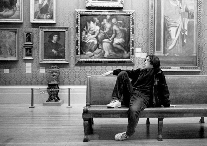
Black & White can simplify an image, making the action or subject have much greater visual coherence.

Patterns usually show up much more strongly in monochrome, so if you are interested in the patterns of the world around us then black and white should be for you.

Light is often more evocative in monochrome because it excludes the confusion of colour of light, so the subject, the light, becomes foremost to the viewer.

Black and white can be timeless, giving no clue as to when the image may have been taken, thereby invoking the past.

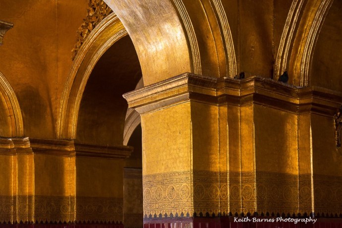
Colour Photography
Colour can add to an image something that monochrome cannot. Think of a fire – see it in black and white and it loses all its power, or how a sunset in monochrome completely misses the point.


Individual colours have emotional triggers in us – they make us feel. Red can be associated with power and strength but also anger. Blue can be calm and tranquil. Yellow can be uplifting and spiritual. Pictures that use one colour as the main basis for conveying ideas have something that simply cannot be achieved in monochrome.

Colours that are complimentary, i.e. are on opposite sides of the colour wheel, offset each other and strengthen each other by their juxtaposition. Usually, the hotter colour will dominate.
Colours that are harmonious, i.e. are found adjacent to each other on the colour wheel, convey a sense of wellbeing and harmony.

Colour can add flavour or taste. Think of food photography in black and white; just as smell affects our taste, colour also affects our responses to flavours.

Colour can be the point of the composition. It is the thing that creates the image, allowing the eye to find the elements of the picture that make it work. Like the gold in this temple in Mandalay.
Colour can just be playful in a way that monochrome cannot. It can highlight something that brings a smile to the mind.

As you can see, there is no right, wrong or ‘better’ way for the photographer. Colour and monochrome offer different qualities and you should choose what works best for you in any given situation. Trust your artistic instincts and use what you want to convey your ideas.


