After decades of bold colours, punchy patterns and excess in interior design, the 1990s brought a wave of minimalism.
Homeowners decorated with lots of natural colours in serene tones, stripping their walls of the garish and chintzy patterned papers of decades past. Instead, walls were painted with 50 shades of beige.
Magnolia (the beige-cream shade) was ubiquitous in the 90s. While it started out with good intentions in homes up and down the country, the colour soon earned a negative reputation.
The colour became known as ‘landlord beige’ because letting agencies used it to decorate their properties throughout.
Riding the wave of the minimalist trend, The White Company launched in 1994 (the company make stylish products, principally in white). And a few years later, interior designer Kelly Hoppen (known for her almost exclusive use of taupe) published her first book.

The pared down aesthetic continued to grow in popularity throughout the next few decades. Fast forward to 2016, and it’s still preferred by many homeowners today.
Now there’s a bigger choice of neutral shades on the market. Take the countrys leading paint manufacturer, Farrow & Ball for example. If you browse their website, you’ll find a guide outlining six core neutral families.
Each group of neutral colours have different undertones (like architectural blue-based greys, contemporary neutrals with a lilac based tone, etc). You can use each set of neutrals as colour schemes in their own rights.
Grey:
Grey has been a popular choice throughout the current decade, but in recent years, it has soared in popularity. Possibly due to the recent ‘industrial trend’ and the rise in demand for concrete products (see here for more information).
Homeowners opted for soft dove grey tones and paired with shades of off-white to create bright and airy spaces.

‘Greige’
‘Greige’ is now taking Pinterest and Instagram by storm. (Interior design magazines coined the term; it is a portmanteau of the words grey and beige).
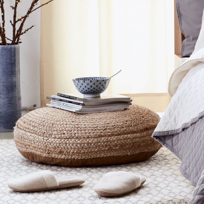
This shade has all the regal sophistication of a stone grey, while its warm beige undertone stops rooms from feeling too cold. See the greige bedding below –

Houzz calls greige an an “organic, elegant neutral that is very easy on the eyes”. While HGTV Magazine declared the modern hue as “the hottest neutral” right now.
How to decorate with the new neutrals:
Despite being one of this year’s biggest trends, neutrals have a timeless appeal. This means you’re unlikely to get bored of the room’s decor too quickly.
If you’re planning to refurbish your home this year, consider ditching the 90s magnolia for a modern soft, warm grey instead.
Here are a few dos and don’ts to help you get started:
DO choose trying layering warm neutrals with soft browns and rich creams.

DO add plenty of natural textures like grained woods, chunky textiles, linen and raffia. These work beautifully with warmer neutral tones.

DON’T choose a brilliant white paint for walls, your room will feel too cold and clinical.
DON’T be afraid to add a couple of darker wooden pieces to the room. This will add a little depth and contrast to the space.

DO choose an off-white colour with a red or yellow undertone. This will feel more pleasing as it will mimic the warmth of a summer day.
DON’T be afraid to use prints in furnishings and on wallpaper, but DO opt for subtle designs in wispy hues.


